
Tutorial · The Beginner’s Series · 18 min read
How to design a menu card that people can actually read — and order from.
A step-by-step tutorial for restaurant owners, cafe managers, and anyone designing their own menu for the first time. Written by a working designer with strong opinions about most of the common mistakes.
By Margot Ellery · Editor

Before we begin, I want to set expectations. There is a great deal of writing online about menu design that promises to teach you the trade in fifteen minutes using nothing more than an AI tool and good intentions. Most of it is not very good. It treats menu design as a list of cosmetic decisions to be sprinkled over a list of dishes, when in fact the order of operations is almost exactly the opposite. The dishes are the easy part. The design decisions are the work.
What follows is a nine-step tutorial that reflects how I actually approach a menu when a restaurant owner sits down across from me and shows me what they currently have. It is not a quick fix. If you follow it, you will end up with a menu that is genuinely better, not just one that looks more polished in a screenshot. That is the trade you are making, and I think it is worth making.
A note on tools. I will mention specific software where it is useful, but the steps themselves are tool-agnostic. You can execute every one of them in Canva, Adobe Express, Affinity Publisher, Microsoft Word, or by laying type out on graph paper. The decisions are the same. The interface is the smallest part of the work.
Step 01
Sit down with the actual menu and read it out loud.
This is the step nobody does and almost everyone needs to. Before you open any design software, print or write out the current menu — every dish, every section, every price — and read it aloud from start to finish. Have someone who has never been to your restaurant sit across from you and listen. You will discover, usually within the first two minutes, three or four problems that no amount of typography is going to fix.
You will notice that two dishes have nearly identical descriptions. You will notice that the section called Starters is technically larger than the section called Mains because two of the “starters” are really small mains. You will notice that the dessert called “Chef’s Special” has not changed in eighteen months. You will notice that you offer fifteen pasta dishes and your average customer orders only three of them.
This is the work of menu engineering, which is its own discipline that I am not going to teach you here, but the smallest version of it is this: read the menu out loud, write down everything that confused you, and fix the content before you touch the design. A beautifully designed menu of the wrong dishes is worse than an ugly menu of the right ones.
Step 02
Decide what kind of restaurant you actually are.
Most menu design problems come down to a mismatch between the design and the establishment. A bistro that prints its menu on heavy cream stock with copperplate script and gold foiling is signalling that it is a special-occasion destination. A bistro that prints its menu on slightly glossy white paper with a sans-serif typeface and bright food photography is signalling that it is a quick lunch stop. Both of those are valid choices. Both of them tell the customer, before they have read a single dish, what kind of meal they are about to have.
Before you make any visual choices, write down five adjectives that describe your restaurant honestly. Not aspirationally. Honestly. If the words on your list are “cosy, informal, family-run, generous portions, fair prices,” that is a different design brief than “modern, refined, quiet, ingredient-led, expensive.” The menu is the silent welcome at the door. It needs to say the same thing the restaurant says.
If you cannot honestly write five adjectives, ask a regular customer to do it for you. Their answer is almost certainly closer to the truth than yours.
Step 03
Pick a format. Not a layout — a format.
The format is the physical object the menu will become. Single-sided A4. Bi-fold A3. Tri-fold US letter. A small card on each table. A six-page booklet. A laminated table tent. The format determines almost everything else — how much you can fit, how readable it will be, how often you can update it, how expensive it is to print, and how the customer will physically handle it.
Most small restaurants overestimate how much space they need. A menu with twelve dishes does not require six pages. A menu with twelve dishes works beautifully on a single A4 sheet, with room for a small headnote and the practical details (allergens, opening hours, the wifi password). A menu with sixty dishes is a different design problem entirely and usually a signal that you should consider whether you really need sixty dishes.
The other thing the format determines is how often you can update. A single laminated sheet costs three pounds to reprint. A leather-bound booklet costs forty. If your menu changes seasonally, design for the cheap reprint. If it never changes, you can spend more on the physical object. Match the format to the actual rate of change in your kitchen, not to the rate of change you wish you had.
“
The single biggest mistake non-designers make on menus is the same mistake people make when they have just discovered they own a wardrobe full of jewellery. They put it all on at once. Every typeface they like. Every flourish. Every illustration. Stop.
Margot Ellery
Step 04
Choose two typefaces. Not four. Not five. Two.
If you take only one lesson from this entire tutorial, let it be this one. Professional menu designers almost without exception use two typefaces per menu — one for headers and the other for body text. The headers might be a distinctive serif (Playfair Display, Cormorant, Lora). The body text is almost always a clean, highly readable sans-serif at a comfortable size (Inter, Source Sans Pro, Open Sans, Lato).
There is a reason this works. Two typefaces create a clear hierarchy without visual noise. Section titles look different from dish names look different from descriptions look different from prices. Each piece of information has a job, and the typography reinforces the job rather than competing with it. The instant you add a third typeface — a script font for the restaurant name, a decorative font for the section headers, a different sans-serif for the prices — the hierarchy collapses and the customer has to work to read the menu.
If you must use a third typeface, restrict it to a single specific use — the restaurant name in the header, perhaps, or a quote on the back. Then go back to your two main typefaces for everything else. The decorative font is the ornamental hat. You only wear one hat at a time.
A specific recommendation, since I am here. For a casual restaurant or cafe: pair Playfair Display for headers with Inter for body text. For a more refined establishment: pair Cormorant Garamond for headers with Source Serif for body. For a modern, minimal feel: pair Inter for headers (heavier weight) with Inter for body (lighter weight) and let the weight contrast do the hierarchy work. All four of these typefaces are free on Google Fonts, all four work in Canva and Adobe Express, and any of these three pairings will outperform 90 per cent of restaurant menus currently in print.
Step 05
Pick a colour palette of three colours, and stick to it ruthlessly.
A menu needs a background colour, a body text colour, and one accent colour. That is it. Three colours. The background is almost always either white, cream, or a very dark neutral — charcoal, deep navy, forest green. The body text is whatever provides high contrast with the background. The accent colour is where you spend your design budget — the one place a flash of personality appears, used sparingly for section dividers, prices, or callouts.
Common mistakes: a different colour for each section, a different colour for each dish, a rainbow of highlight colours marking different dietary requirements, and the cardinal sin of pale grey text on a white background because someone thought it looked “modern.” Grey-on-white reads as expensive only if you are a luxury brand selling watches. On a menu, it reads as “I cannot see this without my reading glasses” to the substantial portion of your customers who actually cannot.
If you want a palette starting point, here are three that consistently work for small restaurants. For warmth: deep forest green, off-white, terracotta accent. For modern minimal: white, charcoal text, single bright accent (mustard, cobalt, or rust). For traditional: warm cream, dark brown text, sage or burgundy accent. Pick one, stick to it, and resist the urge to add a fourth colour for any reason.
Step 06
Organise the menu the way the customer reads it, not the way the kitchen makes it.
The kitchen organises food by preparation method, station, or ingredient. The customer reads the menu by the order in which they will eat. Those are not the same thing. The customer wants starters, mains, and desserts in the order they will eat them. The customer wants beverages and wines clearly separated. The customer wants dietary requirements visible without having to read every line.
Standard structure works because standard structure works. Starters, mains, sides, desserts, beverages. There is a reason every restaurant uses some version of this and that reason is that customers know how to read it. Innovation in menu structure is mostly a way of confusing your customers in pursuit of a sense of originality nobody asked you to have. If your menu has a strong concept — small plates, family-style sharing, a tasting format — deviate from the standard. Otherwise stick to it.
Within each section, eye-tracking research has shown that diners read in predictable patterns. On a single-page menu, the eye tends to drift to the upper right first, then the upper left, then down. On a bi-fold menu, the right-hand page gets more attention than the left, and the top of each page gets more attention than the bottom. This is useful to know for one specific purpose: put the dishes you most want to sell in the spots the eye actually goes. Not the highest-priced dishes. Not the chef’s favourites. The dishes that are most profitable for you and that customers genuinely enjoy. This is the heart of menu engineering.
Step 07
Write descriptions that are short, specific, and honest.
A menu description has two jobs. It tells the customer what is in the dish. It makes them want to order it. Most menu descriptions fail at one or both. The two failure modes are equally common and equally unhelpful.
The first failure is the inventory list: “Grilled chicken with mash and vegetables.” Technically accurate. Tells you nothing about whether you would enjoy it. Could be the worst grilled chicken in north London or the best. The customer has no way to tell. The second failure is the overwrought adjective explosion: “Succulent, hand-reared, free-range chicken nestled atop a velvety bed of stone-ground mashed Maris Pipers and accompanied by a medley of seasonal organic vegetables, lovingly prepared by our award-winning chef.” This is what menu descriptions look like when somebody is trying too hard. You can hear the strain in every adjective.
The middle path is short, specific, and honest. “Grilled chicken thigh, garlic mash, charred broccoli, lemon.” Twelve words. Tells you what the dish is, what makes it interesting (the lemon, the char on the broccoli, the choice of thigh over breast), and leaves the praise to the customer rather than asserting it. The best menu writing trusts the reader. The worst tries to convince them.
A working rule: aim for ten to fifteen words per description. Lead with the protein or the main ingredient. Name two or three things that make the dish specific. Stop. The customer fills in the rest. Their imagination, properly invited, does more work than your adjectives ever will.
Quick Reference
Menu descriptions: before and after.
| The Dish | The Wrong Version | A Better Version |
|---|---|---|
| Grilled chicken | Tender grilled chicken breast served with seasonal vegetables and our signature herbs. | Grilled chicken thigh, garlic mash, charred broccoli, lemon. |
| Pasta starter | Homemade pasta with rich, hearty tomato sauce, fresh basil leaves, and a sprinkle of Parmesan. | Tagliatelle, slow-cooked tomato, basil, Parmigiano. |
| Fish main | Pan-seared catch of the day, succulent and flaky, prepared by our award-winning chef. | Pan-fried sea bass, brown shrimp butter, samphire. |
| Dessert | Decadent chocolate fondant with a molten centre, served with vanilla ice cream from a local dairy. | Dark chocolate fondant, vanilla ice cream. |
Notice that the “better version” columns are almost always shorter, more specific, and less self-praising. The customer fills in the rest. This is the discipline of menu writing.
Step 08
Handle the prices like a working designer.
There is a small body of published research on menu pricing typography that has become widely cited and is mostly correct. The most consistent finding is that removing the currency symbol — printing “14” instead of “£14” — reduces the psychological friction of seeing the price. A Cornell University study found this small change can increase average spend by around eight per cent. Whether you use this lever is partly an aesthetic decision and partly a commercial one. I find that more upmarket establishments tend toward symbol-less prices and casual ones tend to include the symbol. Neither is wrong.
More important than the symbol question is how prices are positioned. Avoid running prices in a column down the right edge with dotted lines connecting the dish to the price. This is the menu equivalent of writing a shopping list on dinner stationery — it draws the eye straight to the cost and turns the menu into a price comparison. The professional alternative is to place the price quietly at the end of the dish description, in the same typeface as the body text, perhaps a single weight heavier. The price is information, not a feature. Treat it accordingly.
One more pricing-typography rule. Always round to whole numbers if you can. “14” reads better than “13.95” on a menu. The 95p strategy works in supermarkets, where customers are price-sensitive and the saving is psychologically meaningful. It does not work in restaurants, where the customer is choosing between dishes within a known price band and the extra digits read as cheap.
Step 09
Print it. Hold it. Read it. Then fix what is wrong.
Here is the step almost no first-time menu designer takes seriously enough. Once your design is finished on screen, print it — on the actual paper you are planning to use, at the actual size you are planning to print at, and ideally on a printer that approximates the conditions of your final print run. Then put the printed menu in the environment where it will live. Take it to the restaurant. Put it on the table. Hold it under the light the customer will hold it under. Read it through twice.
Three things you will discover that you could not see on screen. First, the body text size is almost always too small. What reads as comfortable on a laptop screen at 100 per cent zoom reads as cramped on the physical page. Add one or two points to your body text before you print final. Second, the contrast between text and background is almost always lower in print than it appears on screen. If your designed-on-screen version uses charcoal text on cream, the printed version may need to be slightly darker. Test it. Third, paper choice changes everything. The same design printed on bright white 90gsm office paper, heavy 200gsm uncoated cream stock, or matte 170gsm coated stock will read as three completely different documents. Print on the stock you actually plan to use.
One more thing. Show the printed menu to three people who do not work in your restaurant. Watch them try to read it. Watch where their eye lands first. Listen to which dishes they pick out. Listen to which questions they ask. Their feedback in those thirty seconds is more useful than any amount of design theory. The menu has succeeded when three strangers can read it, navigate it, and want to order from it without asking you what anything is.
A final word.
If you follow these nine steps, you will end up with a menu that is genuinely good. Not award-winning, perhaps. Not a piece of work a senior designer at a London branding agency will study for hours. But a menu that does its job — tells the customer what they can have, makes them want it, fits the restaurant it belongs to, and reads cleanly under the light it lives under. That is the entire bar, and most printed menus in this country do not clear it.
The trick to designing well is not learning a hundred rules. It is learning six or seven rules properly and applying them with discipline. The nine steps above are the rules that account for almost all of the difference between a menu that works and one that does not. Master them, and you will be ahead of most people who call themselves designers professionally, never mind those who are designing their first menu over coffee on a Sunday afternoon.
Write in if you make something. I read everything, and the work I see from restaurant owners designing their own menus is, quietly, some of the most enjoyable correspondence I get.
Margot Ellery
Editor · Printable Menu Lab
Reader Questions
Twelve questions on designing your own menu.
How long should it take to design a menu?
A first version from scratch, following these steps properly, takes roughly four to six hours of work spread over a week or two. The week or two matters — you want time between iterations to come back to the work with fresh eyes. A quick update to an existing menu — new prices, a few new dishes — can be done in twenty minutes.
What software should I use?
Canva for most small restaurants. Adobe Express if you want more typographic control. Affinity Publisher if you need to design a multi-page booklet and want a real layout tool. Microsoft Word for the smallest, simplest single-page menus. The tool is less important than people make it.
Can I use AI to design my menu?
Yes, for parts of it. AI image generators are useful for background graphics or decorative illustrations. AI tools claiming to generate a full menu from a text prompt produce useful starting points perhaps a third of the time, but the result almost always needs a designer’s eye to be properly usable. Treat AI output as raw material, not finished work.
What size should my menu be?
A4 single-sided for small menus (up to about twenty items). A4 double-sided or A3 bi-fold for medium menus (twenty to forty items). For more than forty items, consider whether you really need that many dishes. The number-one menu mistake in the UK is offering too many dishes badly. Offering fewer dishes well is almost always a stronger commercial position.
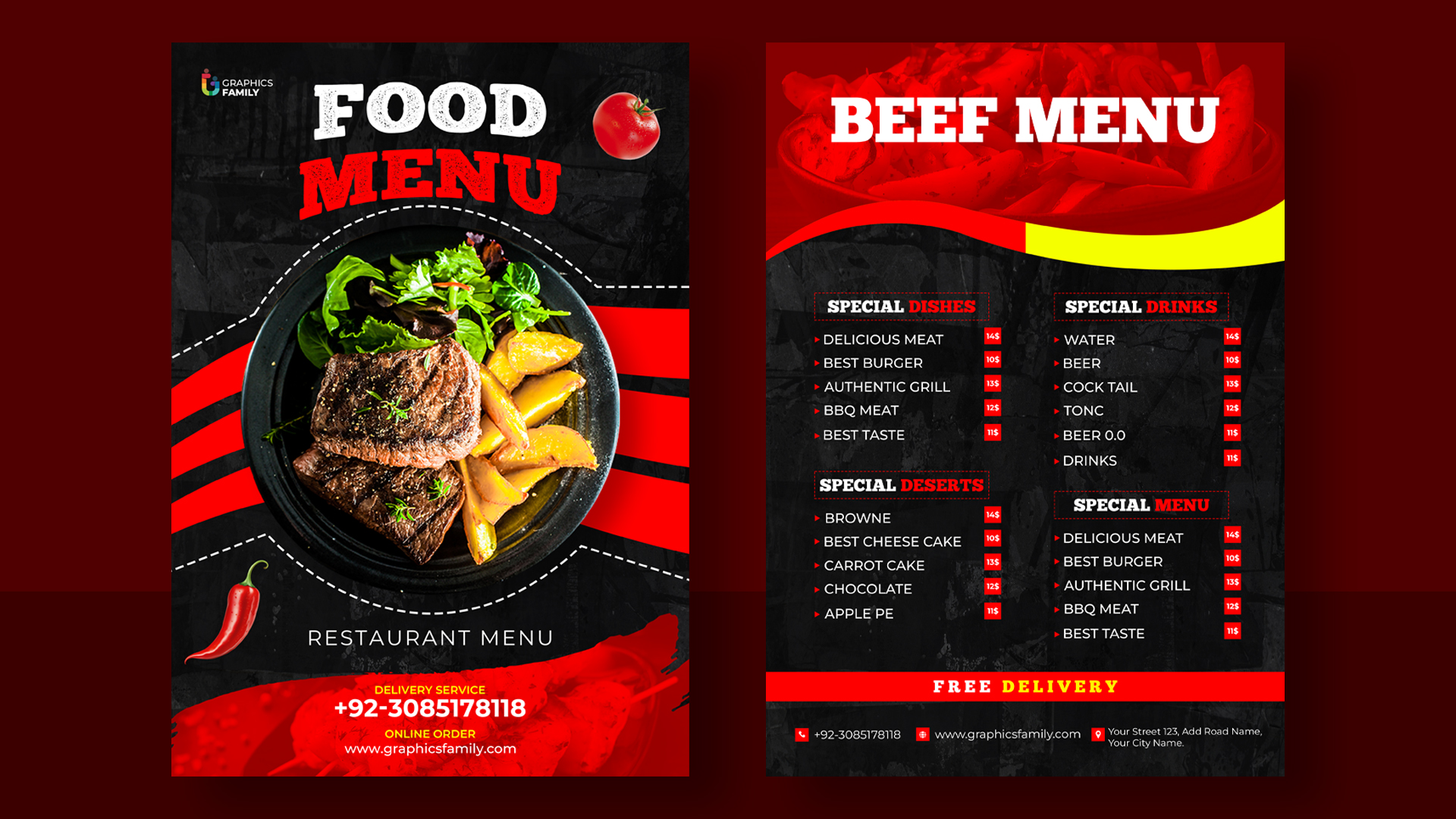
Should I include photos of the food?
Generally no. Food photography is hard to do well and reads as low-end in most contexts unless the photographs are genuinely excellent. The exception is fast-casual restaurants where photos help with quick decisions, and certain cuisines (notably Chinese, Japanese, and some Indian restaurants) where photographs are an expected part of the menu format. Otherwise, leave the photos for Instagram.
How do I handle dietary requirements?
Use small, consistent symbols next to each dish — V for vegetarian, VG for vegan, GF for gluten-free. Put a key at the bottom of the menu. Avoid colour-coding (it looks busy and creates accessibility issues). Avoid spelling out “suitable for vegetarians” in full next to each dish — that takes up too much space and gets repetitive.
What paper should I print on?
For most small restaurants, 170gsm to 200gsm uncoated stock in cream or warm white. This is heavy enough to feel substantial without being card-like, and uncoated stock takes ink beautifully for typography-heavy work. Avoid bright white office paper (looks cheap) and avoid heavy gloss coatings (looks like a chain restaurant). Your printer can show you samples.
How often should I update the menu?
Prices: as needed, usually two or three times a year. Dishes: seasonally, or as the kitchen changes. Layout and design: every two to three years, or when the restaurant’s brand evolves. A menu that has not been updated in five years signals to customers that the kitchen has not been updated in five years either, whether that is true or not.
Should I align prices in a column?
No. Prices in a right-aligned column with dotted leader lines is the single most outdated menu convention still in widespread use. It draws the eye to the cost first and the dish second. Place prices inline at the end of each description, in the same body typeface, and the menu reads as a description of food rather than a price list.
What is the best font size for body text?
Ten to twelve points for printed menus. Smaller than ten and a meaningful number of your customers cannot read it comfortably. Larger than twelve and you lose space for content. Twelve is more generous and more accessible; ten is more refined and more typical of upmarket establishments. Pick based on your audience, not the trend.
How do I make my menu stand out?
By doing the basics properly. Most printed menus in the UK do not clear the basic bar — readable typography, sensible hierarchy, decent paper, restrained colour, well-written descriptions. A menu that does all of those things looks distinctive almost by accident. Trying to “stand out” with novelty design choices usually backfires.
When should I hire a professional designer instead?
When the brand identity of the restaurant is the entire commercial proposition — a new opening trying to make a splash in a competitive market, a rebrand of an established place, a chain rolling out a consistent identity across locations. For everything else, including most independent restaurants doing the work of running themselves, a thoughtful in-house menu following the steps above will produce results that are competitive with paid design work at a fraction of the cost.